Sparklines Challenge
What are Sparklines?
Sparklines are also known as in cell graphics or charts and they are graphics that are placed inside one cell in Excel. What this means is that we can draw a line graph or a column graph of two, three, thousands of data points in one cell and have it look good and useful.
The purpose of this page is to demonstrate a few features of sparklines as a result of someone suggesting to me earlier this week that the universe had no use for them!
Basic Sparklines
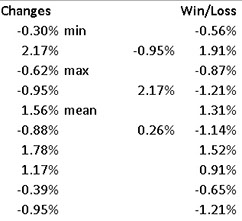
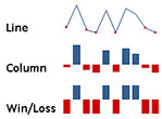
Look to the right and you will see examples of three very basic sparklines: a Line sparkline a Column sparkline and a Win/Loss sparkline. You will see the data they are based on in the table that follows:
Creating a Sparkline
Chose the location of the sparkline by clicking on the cell where you want to put it, eg cell C12. Click
- Insert
- Sparklines
- Line.
- OK.
Excel will then ask you where the data are on which to base the sparkline, tell it, eg B2:B11!
OK!
You now have a Line Sparkline in cell C12.
As you can see I then also created a Column and a Win/Loss sparkline. Line and column sparklines can be based on the same raw data: the changes column in the table above. The Win/Loss sparkline must be based on data such as actual minus the mean, as in the Win/Loss column above.
Sparklines came with Excel 2010 and don't work in earlier versions of it. They are very easy to learn although at first you might not appreciate that you can change column widths and row heights to expand your sparklines and that there are ways to change their vertical scale. For example, I have changed nothing in the Line sparkline on the right but I have changed the vertical scale for the Column sparkline.
More Advanced Sparklines
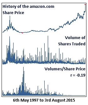
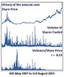
Here are some more advanced sparklines now: they are based on daily opening share price information for amazon.com for the period 6th May 1997 to 3rd August 2015: 4,583 data points. Let's see how a sparkline copes with so many bits of data:
I think those three sparklines look pretty good! So many data points and the horizontal axis has been changed to Date Type. Not only have I created a one cell graphic but I have typed the title of each sparkline in the same cell as the sparklline and formatted it as you can see.
I cheated a bit. Whilst I could have put these sparklines in one cell, what I actually did was to merge five cells in a column and located the sparklines in those merged ranges. Then I made the column wider. The reason for merging the cells is so that you do not have to expand the row heights, which might make a mess of another part of your work.
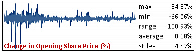
The following graph was created because I could but whether it means much I am not sure: it looks good!
What I did with this Change in Opening Share Price sparkline is to calculate the daily change as a percentage. I changed the horizontal axis to Date Type too and you can see that the share price was very volatile in the early years of trading but it is not so volatile now.
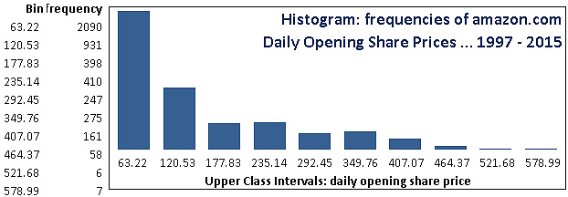
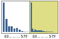
I am ALMOST happy with the histogram that I created from a sparkline:
I created the Bins and the frequency distribution and then created a column sparkline: no cheating apart from merging cells again. I then transposed the Bin range and placed it below the sparkline so that it could look like the upper class intervals.
The only thing wrong with the histogram really is that here should be no gaps between the columns. I haven't found a way to make that happen yet! Read on ...
Since I wrote that page I have thought about the problem of the gaps between thee columns in the histogram and I have solved it. I might be the only person on the planet to have done so at this moment! Take a look at the before and after:
I have not tried to make this new histogram as advanced looking as the version above since it is, after all, just a sparkline but there are no gaps now!
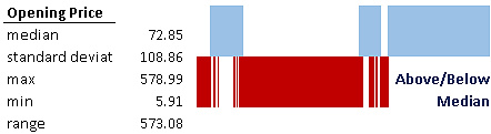
Win/Loss Sparkline
Finally, a Win/Loss sparkline. To create this sparkline I used the median value of the opening share prices and created a new column based on the formula: actual price less median price. The result is then either positive, negative or zero. The chart below mirrors the chart above that shows a lot of volatility in the early years. The vertical scale of the Win/Loss sparkline is fixed since it just shows whether the result is above or below your chosen benchmark.
Conclusions
There you are, some hints on the usefulness and preparation of sparklines both basic and more advanced. You should find sparklines both easy to create and very useful to add to your reports and dashboards.
Duncan Williamson
7th and 20th August 2015
PS This is the very first page of my newly revamped web site.